Beat the Streak: Day 18 - Looking back at 2024

2024 was an exciting season for beat the streak, with several streaks appearing unstoppable and one player even breaking to 50 game barrier. This year was also quite good for me, and while my longest streak was only 20 games, my model was noticeably better than in prior seasons. In this blog post, I'll share some high level statistics about my model in the 2024 season.
Number of Games with At Least One Hit
First we will ignore the model and just look at the outcomes over time. In the figure below, we plot the % Games with Hit across all starting hitters from the year 2000 - 2025. We see that offensive production is overall not what it used to be, although there was a nice uptick since the all-time low in 2020 and 2021. With lower offensive production, it is harder to beat the streak, both because it is harder for an individual batter to get a hit, and because each batter gets less opportunities in a single game. The uptick is caused by the hitter-friendly rule changes that were introduced for the 2023 season, as well as the crackdown on the use of sticky stuff.

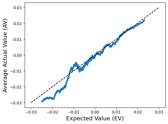
Model Calibration
I have a model that predicts the probability that every starting batter will get a hit in every game. This gives about 41000 predictions across the entire season. In the figure below, we look at how well-calibrated these predictions are. That is, when the model predicts a hit probability of p, what percent of games do those batters actually end up getting hits. To estimate this, we sort the predictions across the entire 2024 season according to the predicted probability, and taking a rolling average of the predicted hit probabilities and the binary observed hit outcome across a sliding window of size 1000. A well-calibrated model would be a diagonal line. shown for reference. The figure shows that the model is pretty well-calibrated, in particular high predicted-probability regime which is the one we care about.

Average Cumulative Success
The plot above gives a good overall sense of the model calibration, but since it averages over 1000 data points, it provides limited insight into the the high-probability predictions that we care most about for beat the streak. In the plot below, we look at the "average cumulative success" of the top-predicted picks. Specifically, we sort the predictions in descending order, and look at the average predicted probability of the top k picks, as well as the empirical frequency of hits among those picks. We plot the results below. The blue line shows what the model predicted, while the orange line shows what actually happened (along with a confidence interval to account for the inherent randomness in the process). The highest-probability picks actually outperformed expectations, as the orange line exceeds the blue line early in the plot. Later on, the they slightly under-performed, but was still within the bounds of the confidence interval. The dashed lines are shown as reference points -- I've been trying to get a model with 80% pick accuracy for quite some time now and it appears I may finally have that.
Top Picks
The table below shows who top picks were across the whole season. Note that they were all at Coors field in Colorado, a known hitter-friendly ballpark. As my streak was getting longer last season, I was patiently waiting for favorable matchups at Coors field. Overall, if I look at the top two picks per day, the model got 78.9% accuracy.

The table below shows the number of times each batter was in the top-2 predictions for the day:

Conclusion
Overall, I'm pretty happy with my model performance in 2024, and I'm looking forward to the upcoming 2025 season!
Comments
Post a Comment